How To Pick Paint Colors For Interior Rooms
You have remodeled your home with the precision of a surgeon, repairing the underlying problems while carefully guarding the original design of each space. But there appears to be something lacking. That item is probably color, the renovator's trump card.
Did you know that crown molding, depending on how it contrasts with the walls, can make the ceiling look higher or lower? Or that the skillful application of color can transform one space into a bustling social hub while rendering another ideal for quiet reflection?
Color is utilized to define spaces and provide focal points in modern homes, which commonly combine the kitchen, living room, and dining room into one enormous open area. The challenge lies in deciding which colors to use and where to apply them.
Color Schemes for the Home's Interior:
Plan a Room Color Scheme to Complement Your Furniture
Bonnie Krims, an architectural color consultant, says it's worthwhile to take her advice in a world where hundreds of colors are available for about $25 a gallon.
Krims advises, "Always remember that while there are thousands of paint chips at the store, there are only seven colors in the paint spectrum," with the seven colors being red, orange, yellow, green, blue, indigo, and violet. Before heading to the paint store, it's a good idea to get rid of a couple of colors, as I always say.
Here are her four foolproof steps for developing a color palette:
If you're at a loss about which paint sample cards to pick out of the rack, Krims has some advice for you: Take note of the strip's darkest shade near its base. You can tell if you'll like the middle and top cards by how much you dislike the one at the bottom, but picking based on the brightest colors will make them all appear the same.
To get started, choose three colors from something already in your house. According to Krims, one should "take a pillow from the family-room sofa, a favorite tie or scarf, or a painting—anything that conveys comfort or has an emotional connection for you" and then bring it to a paint store. Since paint sample strips typically have six different colors, locating three such strips will give you access to an additional fifteen to eighteen hues.
Select one of the three paint colors for the walls and set the others aside to use as accent colors in accessories like throw pillows or throw blankets.
Using the same three-color sample strips, choose a different hue for the adjoining rooms.
Choose a fourth shade to utilize as an accent, and "splash a little of that color into every room of the house" (through pillows, plates, or artwork). According to Krims, this "creates a link between the areas."
Select a surface treatment to provide an aesthetically pleasing result.
Once you've decided on a color scheme, it's time to think about the final coating. While modern flat paints are more stain-resistant, it is generally accepted that a satin (or eggshell) finish is preferable for walls since it is easy to clean and doesn't highlight defects. It was thought that high and semi-gloss finishes were best used on molding profiles and door panels to draw attention to their unique shapes.
However, finishes are also utilized to make an entire wall more visually interesting. "When the light hits the walls, it creates a corduroy or velvet effect," explains Doty Horn, who recommends painting one wall in a flat or satin finish and the neighboring wall in a semi-gloss, both in the same color. You may get a similar matte and sheen contrast by painting the walls flat and the ceiling semi-gloss. The ceiling will feel higher the more light-reflective it is. Remember that a higher gloss setting results in a higher shine and more reflection, drawing even more focus to the surface. When used together, color and gloss can draw attention to a room's finest features.
Choose a color that evokes the mood you want to create in the space.
Paint experts have a mild preoccupation with the psychological effects of color. Many people believe that the function of a room and the desired atmosphere should have at least some role in the selection of paint color.
According to Maxwell Gillingham-Ryan, the blog's co-founder and editor, warm colors like daffodil yellow, coral, or cranberry should be used in public spaces like dining rooms, kitchens, family and living areas, while private spaces like offices, powder rooms, and bedrooms should be painted in cooler hues like sage green, violet, or sky blue.
It's important to remember that orange hues can evoke very different feelings from person to person.
For example, Debbie Zimmer claims, "red will increase your appetite—and your blood pressure; blues and greens are nature like and calming; purple is loved by children but not necessarily adults; yellow is inviting; and orange can be welcoming but also a little irritating, depending on the tint, tone, or shade."

According to Behr's research, the color yellow has a stimulating effect on the brain, making it a good option for study rooms but not bedrooms, where relaxation is the primary objective. Try any of these soothing hues in your bedroom instead.
Know Your Whites
The diversity among whites is astounding. Whites that are truly "clean" have no underlying tints of any kind. These are frequently utilized on ceilings by interior designers to provide a blank canvas that may be used to highlight fixtures or artwork.
The majority of neutral colors, including white, tend to have either warm (yellow, orange, pink, or brownish) or cool (green, blue, or gray) undertones. Mary Rice, a Behr color consultant, recommends "warmer whites" for rooms that lack natural light or for shrinking the perceived size of bigger ones.
In contrast, the use of cool whites can make a room feel more spacious. Try out a few at once to see which one plays nicest with the other hues in the space.
How To Use Interior Paint Colors
1. Make Open Floor Plans Flow
Although continuity is essential on the ground level, using color to "zone" a large open area can help define distinct functions, such as the dining room and the living room. There is no requirement to use only one hue or a limited color pallet consisting of only warm (reds, oranges, and yellows) or only cool (blues, greens, and purples). (blues, greens, bright whites).
"By using muted, dustier values, there's a better chance that the colors you choose will flow into one another," says Tami Ridgeway, a color stylist for Valspar. She suggests gravitating toward grayed-out colors, which are common in historical palettes. Use furniture, floor coverings, and even flowers as opportunities to infuse pops of color.
2. Make Tiny Rooms Feel More Spacious or Cozy
What colors help a room seem larger?
The use of bright whites can make a room feel airier and more spacious, while the use of warm hues can make it feel cozier and more personal. Simply put, larger spaces tend to be able to accommodate a wider range of hues than their smaller counterparts. Debbie Zimmer adds that using lighter colors can make a small room feel more spacious, while using darker colors makes it seem like the surfaces are closer than they actually are.
What hues work best to soften a space?
Some confined areas can successfully pull off a cozy vibe. For instance, hunter green and red may work better than pale peach and celery if you want to create a welcome or intimate feeling in a foyer, study, or library.
3. Applying Color in Buildings
Highlighting a room's architectural details is a great method to employ color for a dramatic aesthetic change. The architectural details of a room, such as the molding, mantel, built-in bookcases, arched doorways, wainscot, windows, and doors, can be painted to complement the wall color and give visual depth.
Painting Molding and Doorways
Sheri Thompson, director of color marketing and design at Sherwin-Williams, recommends painting trim or doors a shade brighter or darker than the main wall for understated emphasis. "The change in color is very subtle, but it draws your attention right to the finer points," she explains.
One further approach to grab people's attention is to paint a metallic glaze directly on top of an already painted element, like a ceiling medallion. When applied to architectural elements, "a copper or bronze finish is very translucent and gives a nice shimmer that enhances the architectural feature," as Thompson puts it.
1. How Do You Change the Door's Color to Match the Frame's?
It's not a cut-and-dry situation, but here's a general rule of thumb: The door's swing side should be painted to match the trim in the room it opens into, and the door's swing face should be painted to match the trim in the room it closes off.
Rooms that are adjacent to one another should have complementary trim colors. Painter Susan English notes that because doors tend to remain open, the trim color of an adjacent room will frequently be visible in any given space. Let's imagine you enter a room through a barn-red door to find pastel yellow walls inside. If done right, this "out-of-place" color can serve as a striking highlight in the room it occupies.
In most cases, a sense of continuity can be achieved by maintaining a single trim color throughout connected rooms connected by open entryways. If you have an open floor plan, you might want to consider painting all the trim white.
2. Experimenting with Coexisting Color Schemes
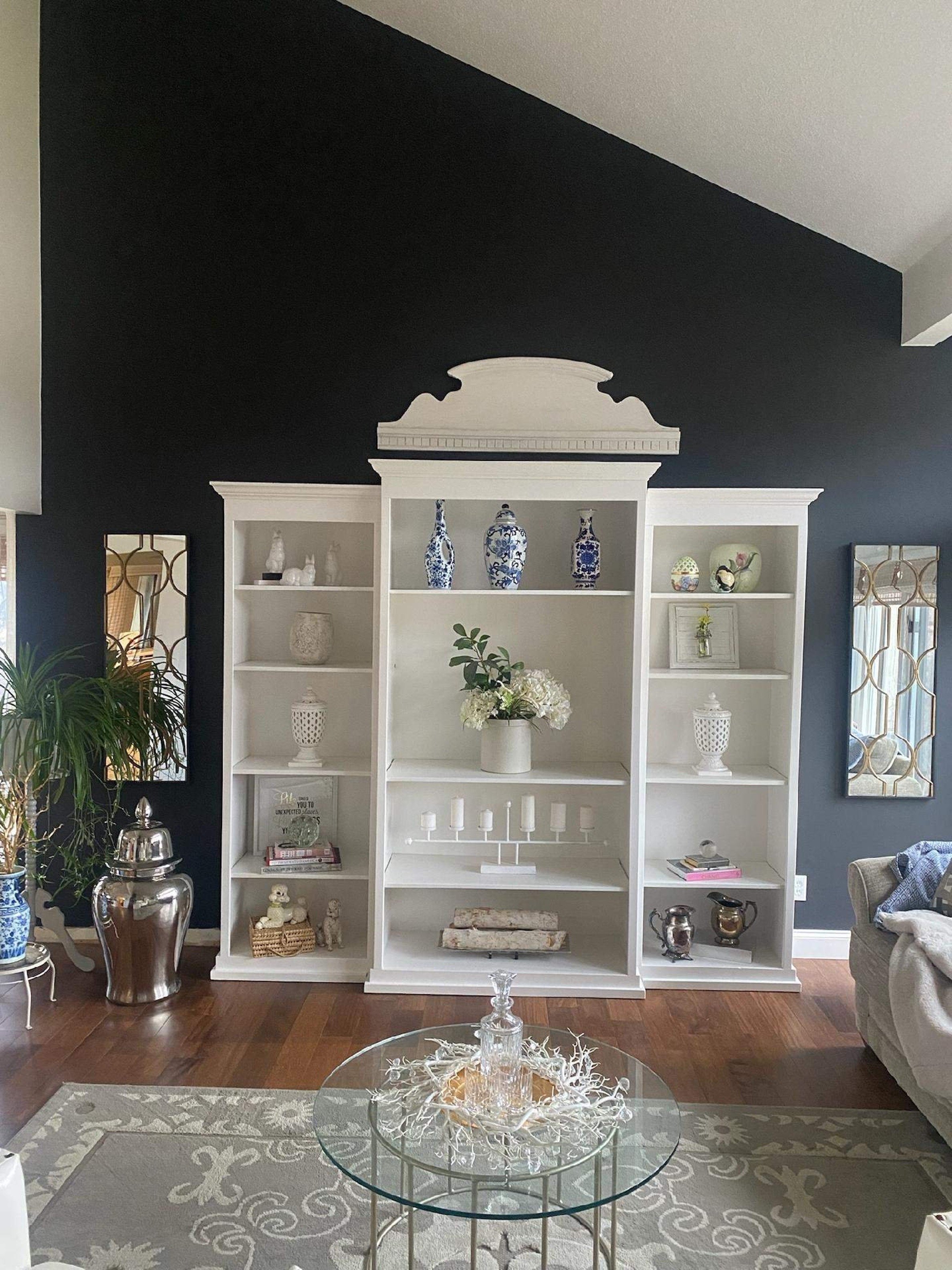
Putting together a room with two contrasting hues is a daring move. In a room with blue walls, for instance, painting a built-in bookcase or niche a shade of green will draw attention to the contents of the shelf or niche. Painting architectural features throughout a home the same color can also provide a unified look and feel. From the Federal era right up until now, white and off-white have been the go-to colors for trims, windows, and doors.
3. Use Wainscoting to Add Visual Interest to Rooms
Wainscot in a room is a great way to play with bright and dark tones. A white wainscot next to a colored wall will bring the eye to the wainscot, whereas a dark wainscot below a bright wall will draw attention to the upper walls. Painting the lower third of a wall one color and the upper third a different color, then installing a flat molding piece at the intersection and painting it to match the lower wall, will provide the appearance of wainscot where none actually exists.
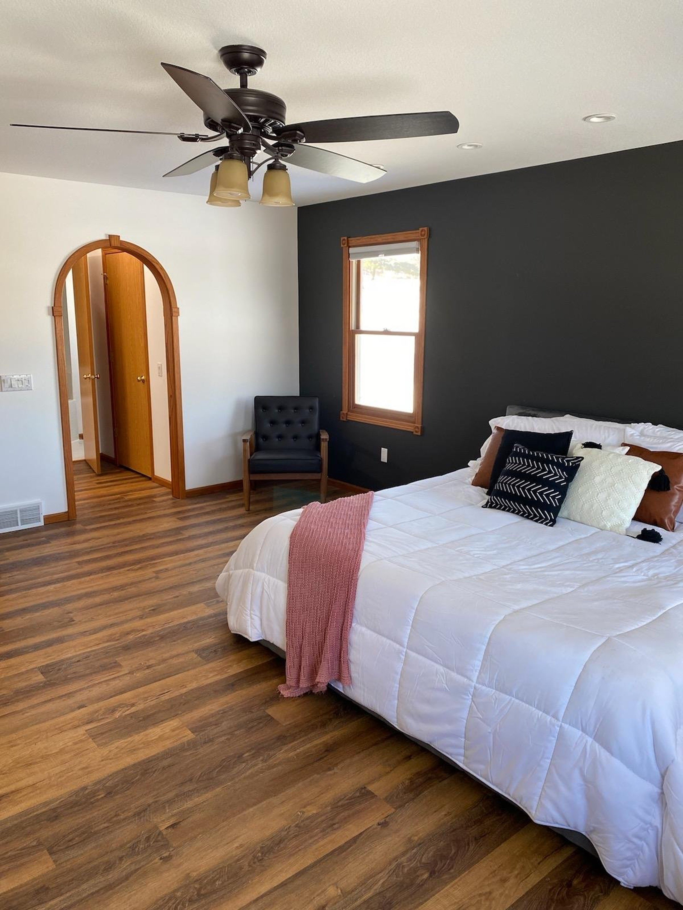
4. Make an Emphasis with an Accent Wall
When all the walls in a room are white or neutral, painting one a striking color can give it a dynamic, up-to-date feel. Another option is to paint the main walls a light hue like beige or celadon green and the accent wall a deeper tone, as suggested by New York color marketing specialist Ken Charbonneau. The room isn't as dramatic, but the accent wall still adds some punch.

5. Try Out Vivid Colors for Some Extra Punch
Doty Horn, director of color and design at Benjamin Moore, suggests rethinking the idea of painting a wall from corner to corner if drama is desired. Doing so will create an architectural focus where none exists. As you go clockwise around the room, consider encircling the corner in color by painting a third of one wall and two thirds of the neighboring wall. Finally, finish painting the remaining 1/8 of the second wall and 3/4 of the wall across the corner.
Another risky move is to paint a large wall almost to the center from both ends, leaving a blank 18–20-inch vertical strip in the middle to hang artwork.
6. Use the Ceiling as if it were a Wall
Painting low ceilings white and crown molding the same color as the wall creates the optical illusion of a higher ceiling.
While "ceiling white" is the standard for creating a light and airy atmosphere, painting the ceiling a lighter shade of the wall color can have the same effect. Choose the wall color that is in the middle of the paint sample card, and then choose a shade or two lighter for the ceiling. When the contrast between the wall color and the ceiling color is reduced, the room will appear larger. If you want to make a tiny area, like a bathroom, seem larger, try painting the ceiling the same color as the walls.
Of course, there are instances when the sense of confinement created by a visually lowered ceiling is appreciated. Ken Charbonneau painted the dining room ceiling in his 19th-century brownstone a Pompeiian Red color. "I get asked if the red paint makes the ceiling too low all the time. But you sit in the dining room the whole time, and you want to make it feel intimate and welcoming, so why not? His 11-foot ceilings are a given. For a comparable calming effect in a home with lower ceilings (say, 8 or 9 feet), try painting the bedroom ceiling a pale robin's egg blue.
It's important to keep in mind the advice of Kathleen Jewell, a color consultant in Orange Park Acres, California: "Warm shades lose their yellow tones on a surface where no sun ever falls, turning bluer and grayer," which means dull.
5 Paint Color Selection Mistakes to Avoid
1. Reluctance to try new interior paint colors
According to New York City color marketing strategist Ken Charbonneau, "the world is divided into two groups—the color courageous and the color cowardly." People that decorate their homes with bright colors "have overcome their inhibitions" Starting with a color you already like (from a rug, painting, or fabric) is the greatest approach to overcome that apprehension. Try it out on a wall first. Your paint retailer may be able to dilute it to "half-strength" for you, making it less intense, or you may ask them to add additional gray to the mix.
2. Applying an excessive amount of paint to the walls
Keep in mind the hues' saturation levels. Do not paint the walls the same bold color as your five- or six-color Oriental rug. Sheri Thompson from Sherwin-Williams recommends painting the walls a brighter shade and making the rug the showpiece.
3. Using an insufficient amount of paint
Consider the 60-30-10 formula used by designers if you feel like your space lacks interest. Typically, the walls contribute 60% of the color to a room, while the furniture, flooring, and window treatments each contribute 30%, and the accent furniture, accessories, and artwork each contribute 10%. Punctuate the monotony of those blank walls.
4. Rushing the painting process
Painting a 4-by-4-foot swatch on the wall and living with it for at least 24 to 48 hours is the best method to choose a color you can live with.
The color you see may change depending on the room's dimensions, the amount of natural or artificial light, and the presence of any number of other factors, from the floor to the furniture.
Doty Horn, a color consultant for Benjamin Moore, recommends taking the time to undertake a swatch test to ensure you choose a hue you'll be happy with for years to come.
Small sample jars of paint are available from a variety of manufacturers. Put your preferred color on a large piece of foam-core board. Try it out in several areas around the room over the course of a few days to see how it reacts to the different types and amounts of lighting.
5. Forgetting to use Primer
Primers, whether white or colored, are essential for achieving the desired hue when repainting walls. According to Michael Baillie, a paint sales associate at The Home Depot, priming ensures that the new paint will adhere to the wall without any interference from the old paint.